


Since the previous post showed some of my least favorite covers. I thought a post showing some of my very favorite covers was called for.

 Please pardon the continued clunky spacing. Google Blogger refuses to cooperate and short of yanking out my hair, there's not much I can do.
 Actually, if I thought yanking out my hair would help - I'd do it!
Top Ten Tuesdays is a weekly meme hosted by the gals over at THE BROKE AND THE BOOKISH. This week: 10 Book Covers I Wish I Could Re-Design. Check out what other bloggers are saying today- after you read mine of course. Okay, grit your teeth. 10 Covers I Wish I Could RE-DESIGN: Actually, more than ten since I had to include a couple of covers for several writers who seem doomed to have either their publishers ignore the content of their books or just have plain bad taste in design.
1) Horrible, horrible cover. There's the close-up eye seemingly beloved of designers. You wouldn't know it from the cover but this is another fabulous book in the Jane Whitefield series.
 2) The people publishing Robert Crais's books probably don't realize that women read his books - that's the only excuse I can think of for these uninteresting, boringly derivative 'manly' looking covers. Not that I would want a soft pastels or whatever, but surely there is a happy medium. I wouldn't even mind these covers if they were - at least - attractive in some way or emblematic of the brilliant, dynamic writing of Robert Crais. You KNOW how much I love his work. So I continue to read his books, loving them and hating the covers.
 And another thing: never NEVER NEVER NEVER put a photo of a a designer's concept of what the main character looks like. NEVER!!! Even if it is only a partial face in close-up. (And not a great photo at that.) Draw it, if you must conceptualize either Joe Pike or Elvis Cole. AND that whole 'eye in the sky' routine is just plain dumb. Years ago when I was looking for a great book to read and I saw this cover of L.A. REQUIEM, I almost, ALMOST, didn't buy it - the cover was such a turn-off. Luckily I bought it anyway. It is one of Robert Crais best books.
 3) Here's a mish-mash of a cover. Bad type choice along with the 'eye in the sky' motif which seems to be popular among designers who can't seem to think of anything else to convey...what? There is no all-knowing fiend in this book. Clarkson is one of the most underrated writers in the business and this is one of his most underrated titles. I loved REED'S PROMISE from the first thrilling page until the nail-bitingly suspenseful end. This is one of those books where I had to stop reading and take tension breaks - it was THAT heart-stopping. If you can find this book, ignore the absurd cover and read it. You will thank me.

5) They never did get the cover for Laurie King's brilliant first mystery in the Sherlock Holmes and Mary Russell series right until the 3rd or 4th try. The trade paperback eventually, finally, had a good cover. And there's one now with a honeycomb design on black which works. But the initial covers for this classic was not only bad design, it was boring and completely un-reflective of the great writing within.
 This green cover is no better. This is not a romance novel nor is the woman pictured on the cover anything like the Mary Russell described by the author. Laurie R. King is a truly wonderful writer and her books are nothing short of brilliant, especially these stories based on a legendary creation. I'm happy to say though, that lately, the covers of the stories have gotten better so maybe someone now is paying attention. I've just seen the new cover for this year's book THE PIRATE KING, and it's a winner.
 7) All I can think is that the publisher had little faith in this book and didn't want to spend any money on design. I mean, what else are we to think when we see something so bland, so banal, so lacking in any hint of the witty, brilliant work lying in wait for the reader. Yeah, I'm using the word 'brilliant' a lot, but what the heck, it's the word that best expresses a few of these favorite books of mine. THE GRASSHOPPER KING most especially. Yet look at this cover, you would never suspect the immense pleasure you are about to find within these pages. This is a great book deserving of an equally great cover.
 8) What would think this book is about? First thought: some kind of cozy. Maybe taking place in New England? Such a nice little picket fence. Well, you'd be totally wrong. THE OUTSIDER is a gritty, sexy, dynamic, heart-breakingly romantic western with a gunslinger hero to die for. It is as different from the 'average' historical romance as you can get. The first time I read it a few years ago I was completely enthralled and actually cried at the end. I'm not a person who 'normally' cries over books, but this heart-stopping ending...WOW! A ridiculous cover that belongs on another book and does nothing to convey the dark and shadowy nature of this book.
 9) Well, this sort of thing is fine if your reading audience is male. But I don't get it being used for a book meant for a female audience. And another thing, Susan Elizabeth Phillips is just too good a writer for this nonsense. I'm really surprised that publishers are still doing this sort of thing. I mean, really, it's the kind of cover that helps give 'romances' a bad name. I wouldn't be caught dead reading this in public. It's a shame really, again I say that Susan Elizabeth Phillips deserves much better.
10) Another silly cover. A blue line of type across the model's lip makes her look as if she's got a mustache. Check out how the woman's arm looks slightly dislocated. The hand appears too small and as if it's been air-brushed to within an inch of its life. Why? Fun colors yes, but the kind of cover that makes me wince.
I didn't bother mentioning most Harlequin covers which are generally just plain awful. But that's understandable. Budget-wise they probably don't have much left over for cover art. One of my least favorite things: when the heroine and hero have blond hair and the cover shows them with dark hair or vice-versa and/or long hair when it should be short - that kind of thing. I mean, is anyone bothering to read the character descriptions? This has nothing to do with budget.
I'm not one either for close-up photos of faces on a cover unless it has something important to say about the book and is not just there to 'prettify'. Really, there aren't that many teenage models who have interesting faces. I also don't like realistic blood-splatter on covers. I'm shrugging my shoulders about this, because of course, it's all about the author and the writing, no matter what. I'll certainly keep reading favorite authors even if all the while I'm grimacing over their covers.

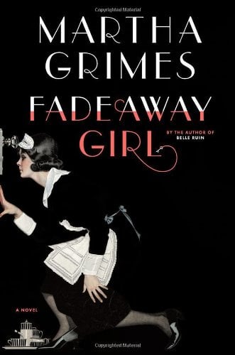

 Sorry about the clunky spacing. Google Blogger is at it again. Been acting up all week and there's not much I can do about it. I think there's an html cure but I'm hopeless at that sort of thing. On with the review: Lately I'm reading faster than I'm reviewing. Don't want to get too far behind because then the stories are in danger of fading into the mist of time that is my brain these days. Hence, Saturday Review today: THE UNCOMMON READER by Alan Bennett. A delightful novella. Beautifully written. A great way to spend a few hours of an evening.


 Today is the birth date of one of my all time favorite Golden Age of Movies actresses: the petite, perky and completely likable Jane Powell (1929 - ) As Ivan said a while back on his blog, THRILLING DAYS OF YESTERYEAR, 'who doesn't like Jane Powell?' She is the original harbinger of MGM sunshine, discovered as a kid, sitting on some steps, looking cute. When asked what she wanted to do, she supposedly replied, 'All I want to do is sing.' She got her wish. Yes, she's a cutie-pie, but in the very best way. And what's more, she's still with us - so, HAPPIEST OF BIRTHDAYS, Miss Jane Powell!
  I love her movies whenever they appear. Love the goofy MGM musicals in which she starred and wowed us with her wonderful voice and charming presence. In DATE WITH JUDY (1948), Wallace Beery played her father! And got away with it. He was wonderful. He was actually able to play the charming curmudgeon who might easily have been anyone's dad. Scotty Beckett played her boyfriend Oogie Pringle. (Scotty Beckett made a career out of playing boyfriends.) A young Elizabeth Taylor also starred.
  Walter Pidgeon played Jane's dad in HOLIDAY IN MEXICO (1946). Who wouldn't want Walter Pidgeon for a dad? Roddy McDowall played the boyfriend. She starred with Tony Martin, Debbie Reynolds and Vic Damone in HIT THE DECK. (1955) Starred opposite Fred Astaire in ROYAL WEDDING (1951). Starred opposite the physically imposing Howard Keel (and held her own) in the classic, SEVEN BRIDES FOR SEVEN BROTHERS (1954).
  But one of my very favorite Jane Powell movies is still, ATHENA (1954). A preposterous fairy tale of a musical co-starring Louis Calhern as Jane's father (she always got the best father figures MGM had to offer) and Edmund Purdom, Debbie Reynolds and Vic Damone.


